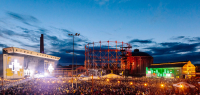
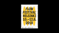
Flow Festival 2018 •
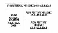
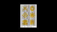
Flow Festival 2018 •
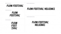
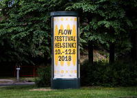
Flow Festival 2018 •
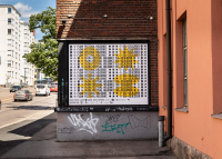
Flow Festival 2018 •
Flow Festival 2018 •
Flow Festival 2018 •
Flow Festival 2018 •
Flow Festival 2018 •
Flow Festival 2018 •
Flow Festival 2018 •
Flow Festival 2018 •
Flow Festival 2018 •
Flow Festival 2018 •
Flow Festival 2018 •
Flow Festival 2018 •
Flow Festival 2018 •